
Disruptive Innovations, Obscure Knowledge, and Subtle Insights Transforming Online Visual Merchandising
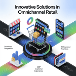
Online visual merchandising has entered a bold new era.
With rapidly shifting consumer expectations and the rise of immersive digital experiences, retailers must now move beyond traditional display techniques and embrace innovation at every level.
While many brands continue to rely on standard image grids and product carousels, those leading the charge are leveraging disruptive technologies, drawing from obscure design knowledge, and mastering subtle psychological cues to reshape how users engage with digital storefronts.
In this article, we explore the cutting-edge frontier of online visual merchandising—where disruption, depth, and nuance are the new competitive edge.
Disruptive Innovation: AI-Driven Creative Direction
One of the most transformative shifts in online merchandising is the emergence of AI-powered creative direction.
These tools use data and machine learning to automatically select, arrange, and even generate visuals that align with consumer intent.
Imagine software that:
-
Analyzes real-time user behavior
-
Predicts emotional responses to colors and layouts
-
Dynamically assembles product pages based on current trends
Tools like Stylitics, Vue.ai, and Adobe Sensei are already integrating AI into the merchandising workflow, allowing retailers to test thousands of visual permutations in a fraction of the time it would take a human team.
This innovation not only saves time but opens the door to hyper-personalized visual experiences that adapt to each customer journey.
Obscure Knowledge: The Z-Pattern and F-Pattern in Visual Layouts
While many designers understand visual hierarchy in broad terms, few online merchandisers apply visual scanning patterns—specifically the Z-pattern and F-pattern—to optimize layouts.
-
Z-pattern design guides the viewer’s eye in a zigzag motion across the screen, ideal for homepages and landing pages that need to create balanced visual flow.
-
F-pattern design follows a more linear path, ideal for product lists and blogs, where the user scans down a column and occasionally across.
By aligning product placements, CTAs, and promotional images to these natural eye movements, you create a subconscious flow that keeps users moving and engaged—without overwhelming them.
Most online stores miss this subtle alignment, leading to friction and visual confusion that weakens conversions.
Subtle Insight: The Power of Human Elements in Product Imagery
It’s common knowledge that high-quality images improve engagement. But a subtle insight often overlooked is the impact of human presence within those images.
When shoppers see products:
-
Being used by people
-
In relatable lifestyle settings
-
With visible facial expressions or body language
…they experience a stronger emotional connection to the item. Even abstract categories like tech and furniture benefit from this approach, as humans instinctively respond to human forms.
Using hands, faces, or implied motion (like a model walking or sitting) in visuals triggers empathy and imagination, increasing click-through and purchase rates.
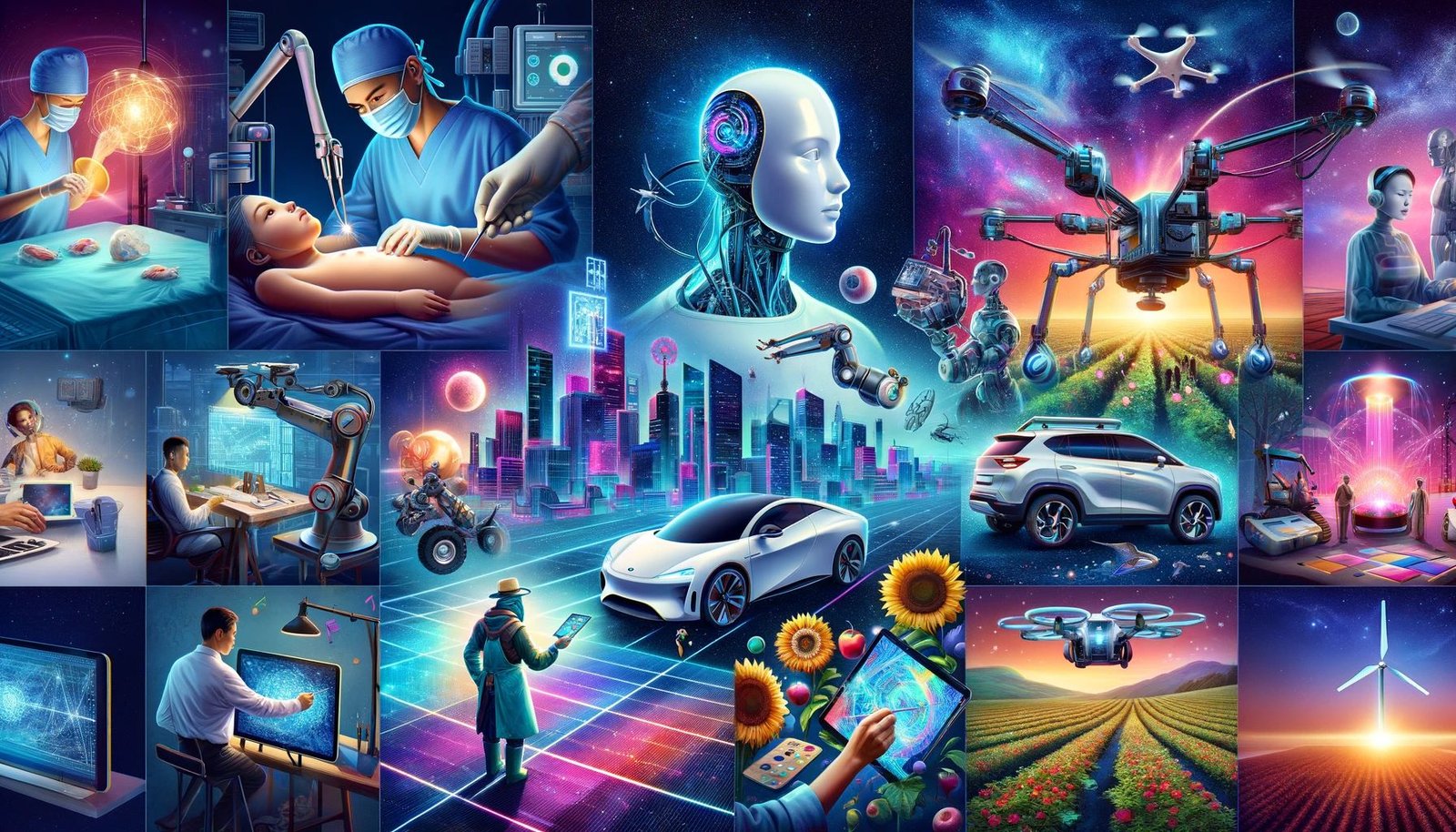
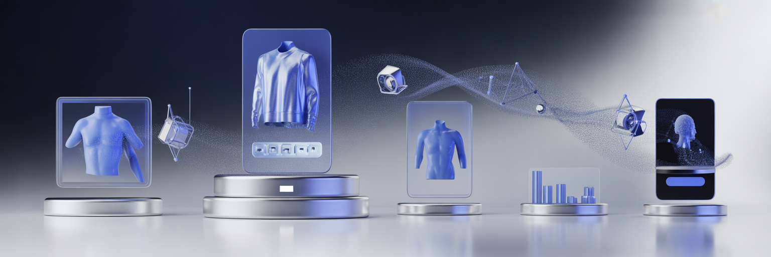
Disruptive Innovation: Visual Commerce in the Metaverse and AR
The rise of the metaverse and augmented reality (AR) has opened up radically new terrain for visual merchandising.
Now, shoppers can:
-
Virtually place a sofa in their living room using their phone
-
Walk through 3D digital stores and pick up products in VR
-
Try on clothes and makeup via real-time facial mapping
These immersive experiences are moving from novelty to necessity.
Shopify, Amazon, and IKEA are already integrating AR-powered features into their platforms—and customers are responding with higher engagement, more confident purchases, and lower return rates.
The disruption here is not just about technology—it’s about shifting the role of visuals from passive display to interactive exploration.
Obscure Knowledge: Color Saturation Hierarchies
Color theory is often used at the brand level, but few merchandisers exploit color saturation hierarchies to direct attention within a product layout.
Here’s how it works:
-
More saturated colors grab the eye first
-
Desaturated colors act as background or support
-
Gradients and contrasts guide visual weight across a page
By manipulating saturation, designers can influence which products, sections, or CTAs get noticed first—even when everything else appears balanced.
This obscure but powerful tool lets merchandisers create natural focal points without relying on borders, arrows, or disruptive overlays.
Subtle Insight: Familiarity Breeds Comfort, Not Boredom
There’s a common misconception in design that repetition is boring. In reality, familiarity breeds comfort, which leads to trust and conversions.
High-performing merchandisers use consistency in:
-
Image composition and lighting
-
Button placement and color
-
Thumbnail sizing and font usage
This doesn’t mean every page looks the same—it means users always know where they are and what to expect visually.
This visual predictability reduces cognitive load, speeds up browsing, and makes the overall experience feel more polished.
It’s a subtle insight that separates visually chaotic stores from ones that feel calm, intuitive, and confident.
Disruptive Innovation: Real-Time Visual Testing and Adaptive Merchandising
While A/B testing has been a mainstay in digital marketing, real-time visual testing is the next frontier.
Platforms like Dynamic Yield and Monetate now offer adaptive visual merchandising, where different users see different visual configurations based on:
-
Geo-location
-
Time spent on site
-
Cart value or browsing stage
This creates a truly dynamic storefront that evolves in real-time—like a skilled in-store merchandiser changing the window display based on foot traffic and weather.
It’s disruptive because it removes the need for fixed visual campaigns. Instead, merchandising becomes fluid, responsive, and individually optimized for every visitor.
Obscure Knowledge: Spatial Anchoring and Visual Gravity
Another subtle concept with major impact is spatial anchoring—the tendency of users to gravitate toward visual anchors placed at predictable points on a screen.
-
Top-left is the most valuable space for first impressions
-
Center-bottom holds attention during scroll pauses
-
Diagonal placements from top-right to bottom-left guide exploratory movement
Using these gravitational zones, merchandisers can place products or CTAs where they’re more likely to receive attention without adding clutter or distraction.
It’s about understanding not just what looks good—but where things look right.
Subtle Insight: Micro-Consistency in Multi-Product Displays
When showing multiple products on the same screen, subtle inconsistencies (like different image angles, lighting, or crop sizes) can cause a feeling of visual dissonance—even if the viewer can’t pinpoint why.
Top merchandisers maintain micro-consistency by:
-
Standardizing product photography templates
-
Matching model poses and shadows
-
Aligning eye levels or product centers
This subconscious harmony improves perceived professionalism and helps users focus on comparing products rather than being distracted by visual noise.
It’s a fine detail—but one that has a measurable impact on engagement and trust.
Elevating Visual Merchandising Beyond the Visible
The next generation of online visual merchandising isn’t about more images—it’s about smarter, deeper, and more responsive visuals.
By embracing disruptive innovations, applying obscure knowledge, and leveraging subtle insights, brands can move from passive product display to active experience design.
Let your visuals do more than decorate—let them educate, guide, and inspire. In the world of digital commerce, the smallest visual details often lead to the biggest business breakthroughs.