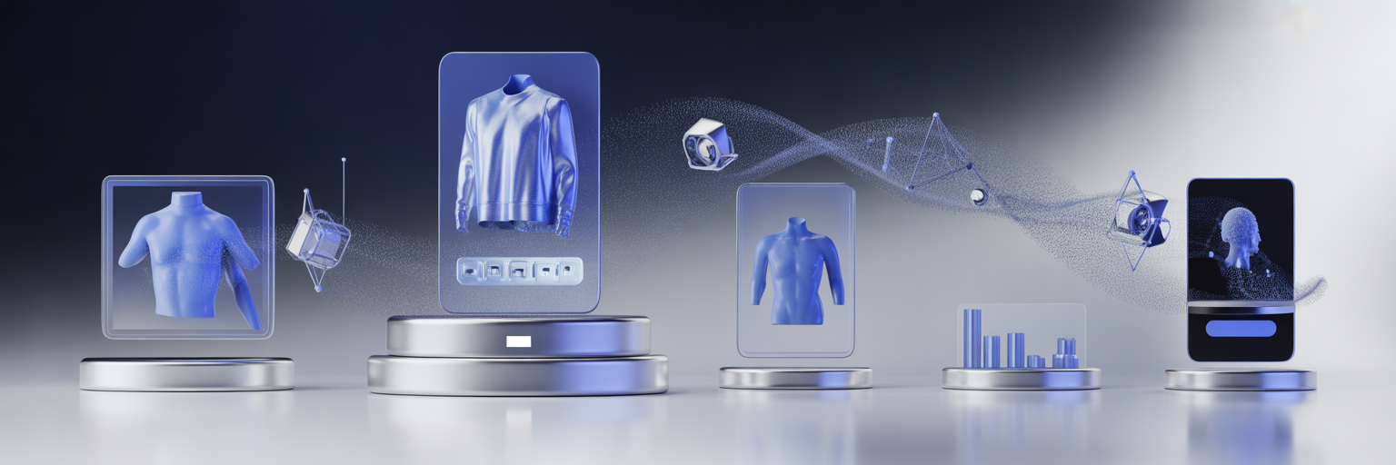

Behind-the-Scenes of Online Visual Merchandising: Advanced Tactics and Hidden Gems for eCommerce Success
Online visual merchandising isn’t just about displaying products neatly on a digital shelf.
It’s an evolving science and art that involves orchestrating every pixel on a screen to influence customer behavior.
While many brands focus on the obvious—bright photos, clean layout, easy navigation—there’s a whole world of advanced tactics and hidden gems that lie behind the scenes of top-performing eCommerce websites.
This blog post takes you deep into the engine room of online visual merchandising, revealing behind-the-scenes strategies, sophisticated techniques, and overlooked practices that can dramatically impact your online sales.
Understanding the Digital Showroom
Imagine walking into a beautifully designed boutique: curated displays, thoughtful lighting, and an experience that makes you want to explore.
That’s exactly what your online storefront should replicate—but digitally.
Behind every well-merchandised website is a thoughtful blend of behavioral psychology, UX design, and data-driven optimization.
Most of the magic happens behind the curtain, and it starts with how brands structure and personalize the customer journey.
Behind-the-Scenes Tactic #1: The Visual Data Layer
Before a single image is uploaded, successful brands analyze what visual content their audience responds to best.
This isn’t just about A/B testing a homepage banner—it’s about creating a full visual data layer.
Brands use tools like Hotjar, Crazy Egg, and FullStory to track:
-
Scroll depth on collection pages
-
Hover behavior on thumbnails
-
Interactions with filters and sorting tools
From there, they create a dynamic map of where customers engage most. These insights then guide layout decisions, color schemes, thumbnail formats, and even text placement.
Advanced Tactic: Visual Merchandising Automation Engines
Manual merchandising works when you have a handful of SKUs. But once your catalog scales into the hundreds or thousands, automation becomes essential.
Advanced eCommerce platforms now use visual merchandising engines—algorithms that rearrange product displays in real-time based on:
-
Product performance (CTR, sales)
-
Customer history
-
Time of day or season
-
Inventory levels
For example, an apparel site might automatically push outerwear to the top of category pages for visitors browsing from colder regions.
This level of dynamic personalization increases relevancy and reduces friction in the customer journey.
Hidden Gem: Asymmetrical Layouts That Drive Curiosity
Most eCommerce sites default to symmetrical, grid-style product layouts. While this provides structure, it can also feel stale and predictable.
One of the hidden gems of online visual merchandising is using asymmetrical design to create focal points and curiosity triggers. This means breaking up the grid:
-
Featuring oversized product blocks for hero items
-
Incorporating editorial-style images between product rows
-
Rotating between portrait and landscape imagery
Asymmetry introduces an element of surprise and motion, keeping customers engaged longer and encouraging exploration.
Behind-the-Scenes Tactic #2: UX-Driven Filter Design
Filters are more than just functional—they’re visual tools that shape how users interact with your products. High-performing websites invest in:
-
Icon-based filters (like color swatches instead of dropdowns)
-
Sticky filters that remain visible as users scroll
-
Smart filters that appear or disappear based on product type
The psychology here is simple: the easier and more visually pleasing it is to filter results, the more likely a customer is to stay engaged and find what they want.
Advanced Tactic: Cinemagraphs for Emotional Impact
Product imagery doesn’t have to be static. Enter cinemagraphs—still images with subtle, looped motion. These can be used sparingly on hero banners or featured sections to create a sense of life and movement.
For example, a cinemagraph of a candle with a gently flickering flame or a jacket swaying in the wind can evoke emotion and enhance product desirability.
While not widespread yet, brands that adopt this technique early can stand out and create a richer sensory experience online.
Hidden Gem: The Art of Negative Space
In visual merchandising, less is often more.
Many brands clutter their category and product pages with too many elements—badges, icons, pop-ups, and competing calls to action.
Savvy merchandisers use negative space (also called whitespace) as a strategic tool. It:
-
Increases visual clarity
-
Focuses attention on key items
-
Adds an air of sophistication
High-end brands like Apple or Everlane excel at this, but the principle works for any store. Clear, uncluttered layouts make the shopping experience feel calm and intuitive.
Behind-the-Scenes Tactic #3: Eye-Tracking-Based Heatmaps
Beyond basic analytics, top eCommerce teams conduct eye-tracking studies to see exactly where users look on a page. These insights guide the placement of:
-
Calls to action
-
Pricing
-
Trust indicators (like reviews or badges)
If customers consistently ignore a section of your homepage or category page, it’s not just a design issue—it’s a merchandising opportunity.
Adjust product positioning based on actual eye movement data, not just click rates.
Advanced Tactic: Sequential Product Storytelling
Rather than showing products in isolation, advanced merchandisers curate product sequences that tell a story. For example:
-
A cookware store might show a saucepan, then utensils, then a plated meal
-
A cosmetics brand could display foundation, followed by contouring kits, then a full-face look
This technique creates emotional flow and helps customers visualize how products fit together, increasing basket size and average order value.
Hidden Gem: Personalized Exit Merchandising
When a customer is about to bounce or exit, many sites throw out generic discounts or pop-ups.
Instead, consider using personalized exit merchandising—tailored product suggestions or editorial content based on the user’s behavior.
For example, if someone spent time viewing multiple sneaker models but didn’t purchase, a stylish pop-up offering a “Top Sneaker Guide” or “Compare Our Bestsellers” could re-engage them meaningfully.
This approach respects the customer journey and feels more helpful than intrusive.
Elevating the Invisible Layer of eCommerce
The best visual merchandising strategies aren’t the ones that scream for attention—they’re the ones that seamlessly guide users, reduce friction, and quietly increase conversions.
The tactics shared here happen mostly behind the scenes, but their impact is anything but invisible.
Whether you’re running a niche boutique or a massive online retailer, embracing these behind-the-scenes techniques, advanced tactics, and hidden gems can help transform your digital storefront into an immersive, intuitive, and high-converting destination.
Take the time to explore what’s happening beyond the surface—because that’s where the real magic of online visual merchandising begins.